10 Classy Christmas Light Ideas That Don't Look Overdone
Key Takeaways
- Classy Christmas light ideas usually center on one deliberate color story rather than layering in every color and style available.
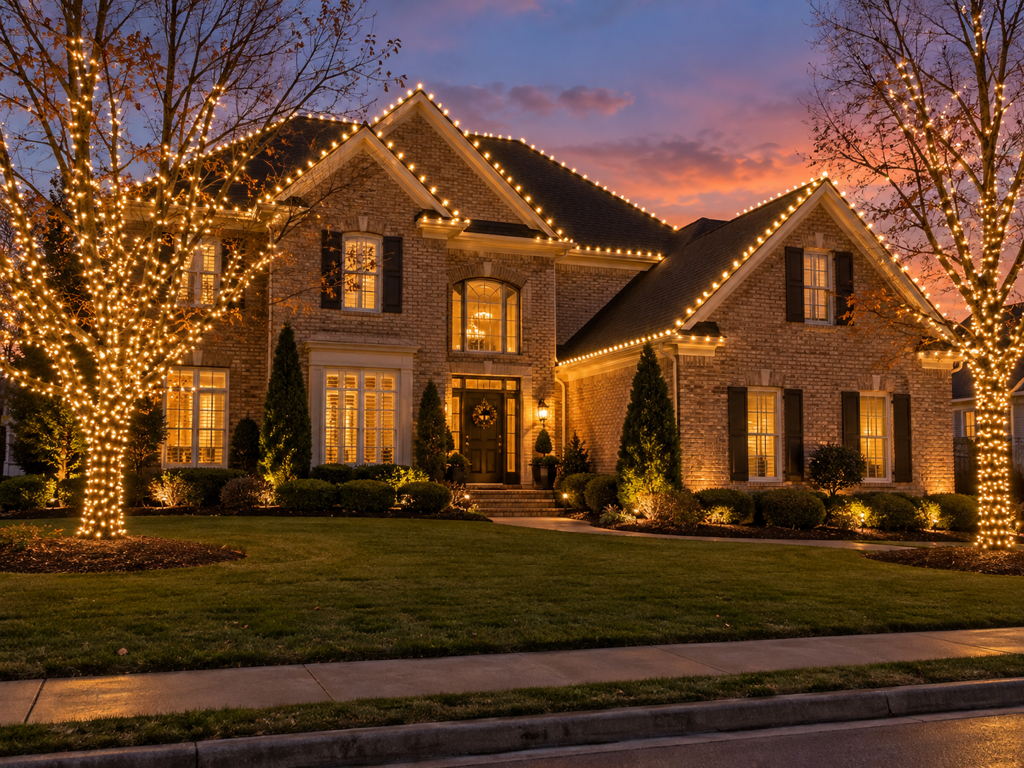
- A single, well-wrapped focal tree tends to have more visual impact than lighting every tree on a property.
- Consistent bulb type and color temperature across a display prevents the mismatched look that reads as cluttered rather than festive.
- Symmetric, evenly matched rooflines photograph as more intentional than scattered or uneven lighting.
- Restraint isn't about doing less overall, it's about fewer, better-executed choices instead of adding one more thing every season.
There's a version of "overdone" that's genuinely fun and a version that's just exhausting to look at, and the line between them usually comes down to how many decisions were made deliberately versus added one at a time over several years. Most classy Christmas light ideas come down to noticing that difference before it happens, not fixing it after the fact.
1. Pick One Color Story and Stop There
Warm white on its own, or warm white with a single accent color, reads as far more deliberate than five colors spread across a property. The fastest way to look cluttered is adding "just one more" color each year until nothing matches anymore. A display built this way rarely looks intentional, even when every individual piece was chosen carefully at the time.
2. Let the Roofline Do the Talking
A clean, evenly spaced roofline run is often enough on its own. Before adding more elements, it's worth asking whether the roofline itself is actually finished, evenly lit, no gaps, both sides matching, rather than reaching for another decoration.
3. One Signature Tree Instead of Every Tree
Wrapping every tree on a property tends to divide attention rather than build it. One well-placed, fully wrapped tree, especially the largest or most visible from the street, usually makes a bigger impression than five smaller, half-wrapped ones.
4. Match Your Bulb Type Everywhere
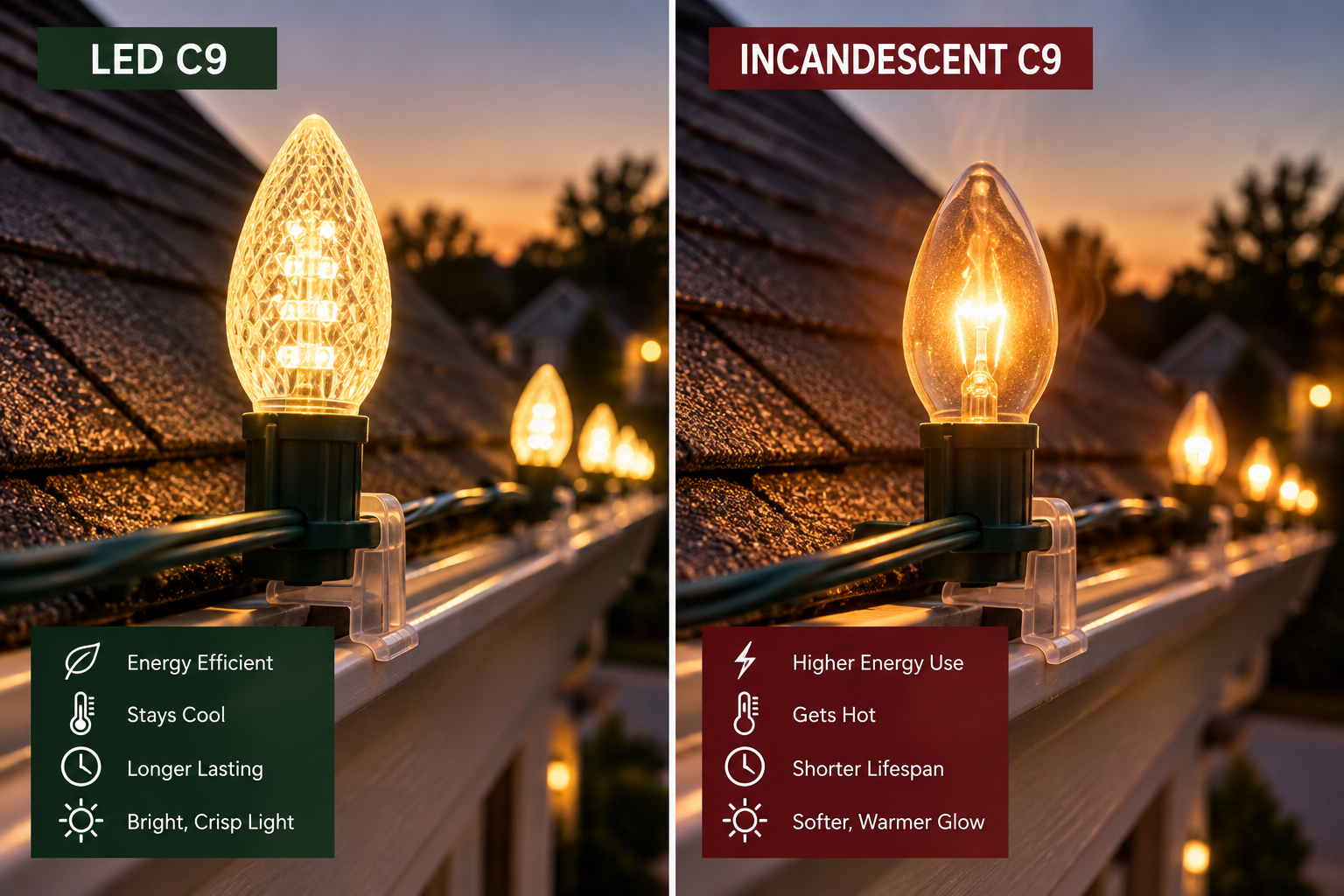
Mixing an older, more amber-toned string with a newer warm-white set creates a subtle but real mismatch once the sun goes down. Sourcing every element from the same bulb line is a small detail that keeps a whole display looking unified.
5. Keep Shrub Lighting Simple
Wrapped shrubs should support the rest of the display, not compete with it. A consistent, single-color treatment along the foundation planting fills the gap between roofline and ground level without adding visual noise.
6. Let Architecture Lead the Design
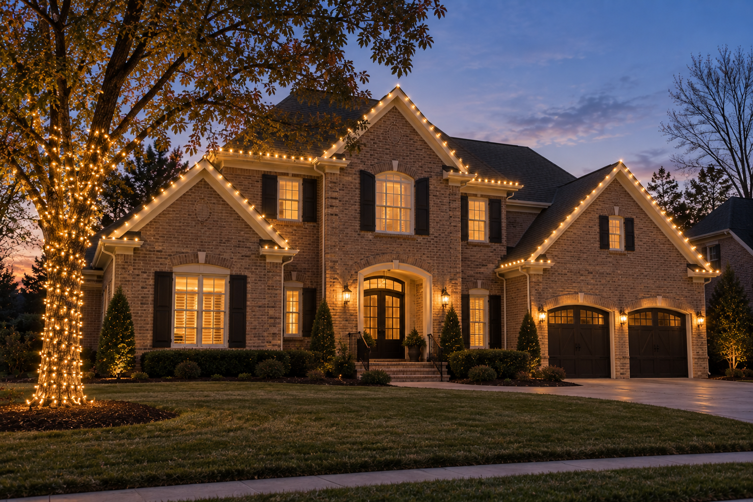
Homes with real architectural detail, columns, trim, stone accents, don't need much added on top. Lighting that emphasizes what's already there, close-set trim lighting or column wraps, tends to look more considered than lighting that ignores the architecture entirely and just adds decoration wherever there's open space.
7. Use a Timer Instead of Running Everything at Max
A display that runs at full brightness every single night can start to feel like it's trying too hard. A dimmable or timed system that runs softer on a normal evening and brighter for a specific occasion adds range without adding clutter.
8. Fewer, Better-Placed Accents
One well-placed accent, a wreath, a wrapped column, a pathway light, does more than five scattered smaller touches. Quality and placement matter more than the total number of decorative elements on a property.
9. Keep Symmetry Where It's Available
If your home has a centered entrance or matching windows, use that. Mirroring lighting exactly on both sides of a symmetric facade photographs as intentional in a way that uneven, asymmetric lighting rarely does, even when the asymmetry is minor.
10. Match the Display to the House, Not a Generic Template
A busy, multicolor display can look great on the right house and out of place on another. Classy Christmas light ideas usually start with what actually suits your specific architecture rather than a look pulled from somewhere else entirely.
A Quick Test Before You Add Anything Else
- Does this new element match the existing color story, or introduce a new one
- Is the roofline itself fully finished before adding more decoration elsewhere
- Would removing this element actually make the display look less complete
- Does it highlight something the house already has, or just add more to look at
Why Restraint Reads as More Festive, Not Less
None of this means a simpler display is less enthusiastic about the season. A well-executed, symmetric, single-palette design usually reads as more considered than a display built by adding one more idea every year without ever stepping back to look at the whole thing together. Classy Christmas light ideas aren't about doing less, they're about deciding what actually earns its place.
It's worth asking, honestly, whether each piece of your current display is there because it works, or because it was there last year and taking it down felt like more trouble than leaving it up. That question alone tends to answer most of what needs simplifying.
If you're not sure whether your current display has drifted from intentional to cluttered, a free on-site quote is a good way to get an outside perspective. We'll look at what you've got and talk through what's actually working and what might be worth simplifying.
Frequently Asked Questions
Does "classy" mean I can't use any color besides white?
Not at all. A single deliberate accent color on top of a warm-white base still reads as classy. It's mixing several colors without a clear plan that tends to look cluttered.
How many trees should I wrap for a restrained look?
One well-placed, fully wrapped tree often has more visual impact than several smaller ones. It's a common way to simplify a display without losing its presence.
My lights don't match anymore after a few years of buying replacements. Is that fixable?
Yes, replacing the whole run with a consistent bulb line is usually the fix. Mismatched color temperatures are one of the more common causes of a cluttered-looking display.
Can a bold, colorful display still look classy?
Yes, if it's deliberate and consistent rather than layered together piece by piece. The issue is usually inconsistency, not color itself.
Get a free, no-obligation on-site quote from our Collierville crew.